Health Insurance Patterns

A website that tells the story of insured rates in the US over time in the context of Medicaid expansion adoption by organizing and visualizing data in buckets, ranges, and scales that complement the narrative.

team

3 Designers
(Elaine Lu, Greg Chen, Youngryun Cho)

timeframe

4 Weeks, Fall 2021

My role

Research, Data Analysis, Wireframing, Web Interface, Narrative Development, Motion Design

tool

Excel, Figma

01  
Background

We are tasked to tell a story using the patterns we identify in the health insurance data from Census. The intriguing part is that while the patterns are objective, the way designers visualize the data would largely affect viewers' perspectives. After the research, we decide to look into the effect of ACA and Medicaid adoption over insured rates on country, state, and city levels and poverty levels. We carefully organize data points in buckets, ranges, and scales that complement the story and use narrative structure and Indexical structure to guide through users' viewing experience. The guiding question we have is:

What can changes in the percentage of insured people over time at the country, state, and city levels tell us about the adoption of ACA and Medicaid in the U.S.?

02  
outcome

Narrative Structure

Guiding Questions

The website starts with meaningful questions that set up the context for viewers to think

Insured rate on a nation level

An overview of the insured rate in the US. It also guides users with step-by-step tutorials.

Insured rate on a state level

By clicking on the timeline, the insured rates on a state level are unfolded

The trend of insured rate on a nation level

Viewers could select the states they'd like to compare year over year

Insured rate on a city level

By double-clicking on a state, it will zoom in and show data on a city level

The trend of insured rate on a city level

Viewers could select the cities they'd like to compare year over year

Indexical Structure

Medicaid expansion years

By clicking the years, viewers could see when each state adopt Medicaid expansion

Poverty level data overlay

Viewers could also turn on federal poverty level < 1.38 filter anytime to overlay the data of the low income on the average

03  
research

Identify Patterns

We first group the raw data and try to find similarities and connections in the cluster of massive data sets. The factor that jumps out is time. Insurance rates are increased over time regardless of social status, demographics, etc.

Source : Census

Health Insurance Policy

In secondary research, many scholars suggest ACA and Medicaid (also known as Obamacare) are the reason for the increase. We are intrigued by the view and decide to verify the statement with data.

Guiding Questions and data cleanup

Q: What changes did the enactment of ACA in 2010 bring to the percentage of insured people?
% of insured people in the USA from 2010 to 2019 YoY

Q: Is the drop of uninsured rate in 2014 the result of Medicaid expansion?

Source : KFF

Q: What changes did the Medicaid expansion in 2014 bring to the percentage of insured people?

  1. Year that Medicaid expansion was adopted by states
  2. % of insured people in 50 states and cities from 2010 to 2019 YoY
Source : KFF

04  
Visualizing data

Scales, Range, Buckets

We filter out the irrelevant data and focus on the data that would help us tell the story, the effect of ACA and Medicaid on insured rates. For example, we have years ranging from 2010 to 2019 to cover pre-ACA and post-ACA. Also, we highlight the milestones of different states adopting Medicaid expansion as soft buckets

Narrative and Indexical Structure

We introduce both narrative structure and indexical structure. In narrative structure, we navigate users to read the data from big (nation) to small (city). Along the way, they are also provided with choices to turn on Federal Poverty Line <138% filter and switch between years with Medicaid expansion year highlighted

Pathway

The pathway we design for viewers to experience

Visual Keys

We use geographical system as the coordinate system because the US map provides a hint for viewers to know where the data story is going to illustrate about. But for the data of each state to be easily comparable on the gird system, we make the state location relative and abstract instead of exact

UI Design

To make sure the difference between years is big enough to see, we design to make circle sizes dramatic between the smallest and the biggest. We also keep accessibility in mind by setting the clickable area to the same size as the biggest possible grid box. Also, the ensure scalability, a design system is created to make future changes efficient

05
reflection

Questions we now raise

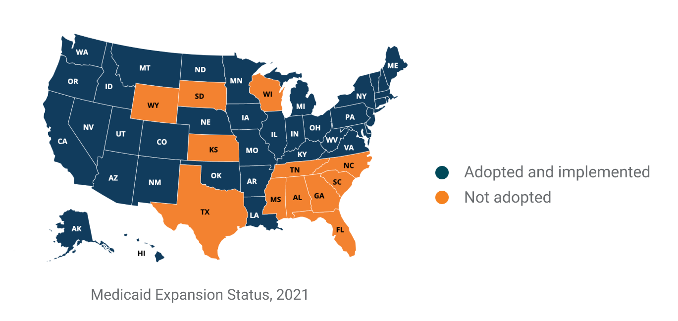
While the narrative we design is to highlight the relationship between Medicaid expansion and insured rates, viewers could also raise questions that Medicaid may not be the only reason. For example, could it be employment rate and insurance prices? This is the reflection we like viewers to think about after experiencing our visualization works.

Representation with minimal cognitive load

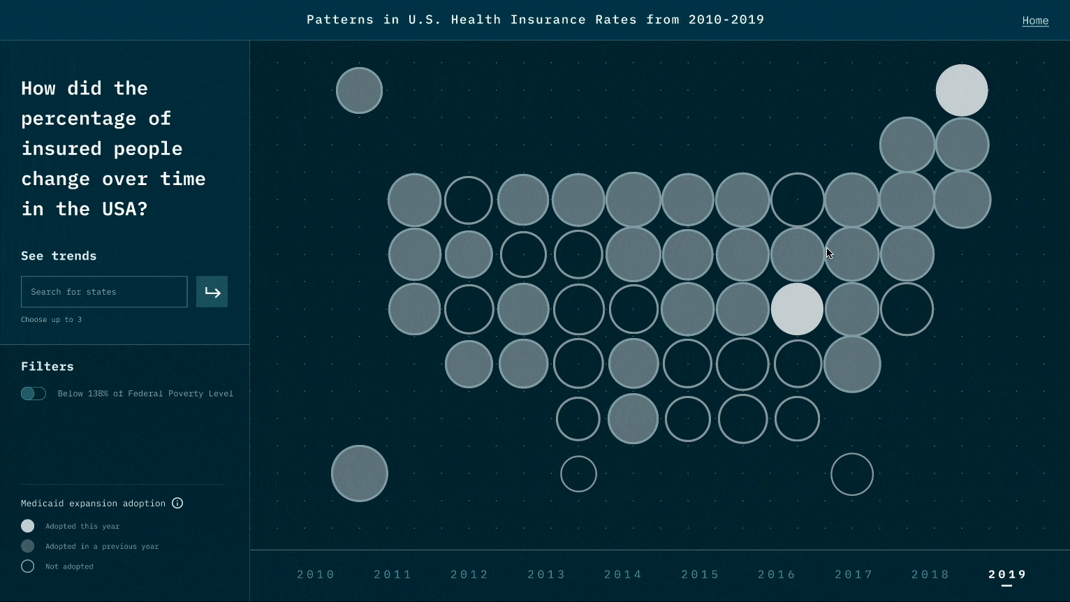
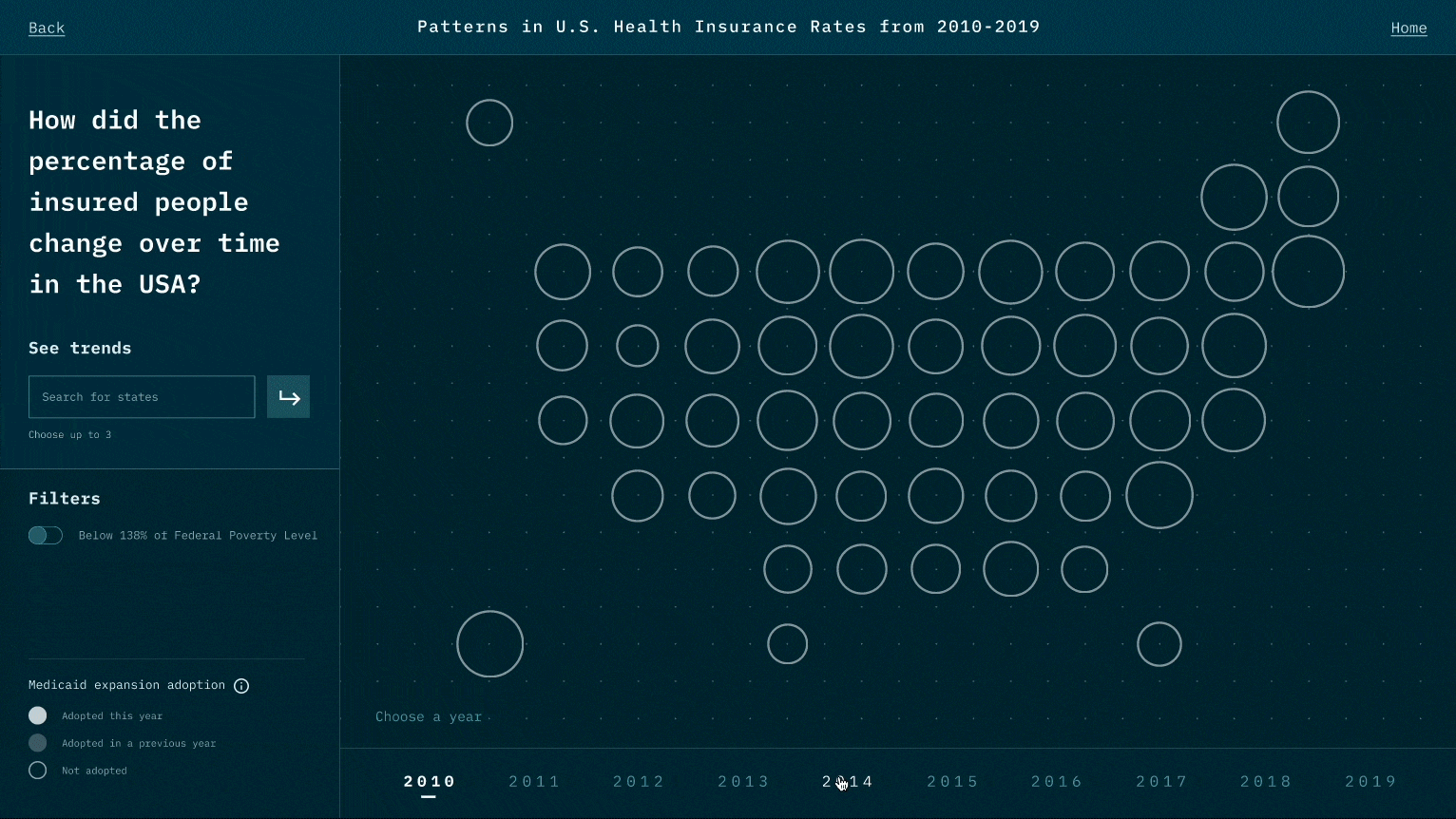
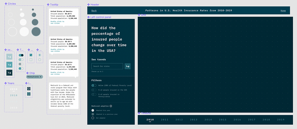
While designing the representation for each data point, we think of many representations that might look cool, such as 3D depth. However, during the test, we realize it creates a jump that requires viewers' great deal of cognitive power to create the link between data and the representation. We thereby minimize the use of representations and try to use those that are associated with existing beliefs and understandings. Also, when there is a new representation, we user motion to create a smoother transition

Data with or Without perspectives

While data itself is objective and unbiased, the way designers visualize data can inject perspectives and navigate viewers' perspectives. It is a double-edged sword. It could be a powerful tool to help people tell the story of their side, on the other hand, it could be used to twist the truth and only tell one side of the story that benefits one party.